
Quick summary
This website showcases top navigation examples that enhance user experience. From simple top bars to creative mega menus, it highlights how effective navigation can drive engagement and conversions. Read more actionable tips on website design and optimization on our blog.
Need Website Navigation Examples That Drive Better User Experience?
Visitors won’t stick around if they can’t find what they’re looking for. Whether you’re building a new site or refining an existing one, smart navigation is key, it makes the difference between frustrated users and those who move seamlessly from point A to conversion.
In this Clio Websites article, we highlight top website navigation examples that can inspire your next design. From clean menus to creative layouts, these examples show you how simple changes can lead to better user experiences.
But before we begin…
Why Listen to Us?
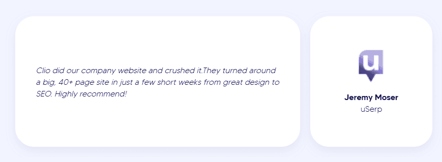
At Clio Websites, we’re a Calgary-based agency that has been designing high-converting, custom websites since 2007. With over 400 businesses served worldwide, we specialize in WordPress development, SEO, and creating user-friendly, responsive websites. Our experience has taught us what makes navigation truly effective, and we’re here to share that knowledge to help you design a seamless, intuitive experience for your visitors.
What is website navigation and why it matters
Website navigation refers to the system of menus, links, and buttons that help users find their way around a website. It’s essentially the map that guides visitors to the content or pages they’re looking for.
Effective website navigation plays a huge role in user experience. Here’s why it matters:
- User Experience: If visitors can’t easily find what they’re looking for, they’ll likely leave quickly, increasing your bounce rate. A well-organized site, on the other hand, encourages users to stay longer, explore more pages, and ultimately convert into customers or leads.
- Accessibility and Mobile Performance: Good navigation supports accessibility and mobile performance – two areas Clio Websites always prioritizes.
- SEO: Search engines like Google use your site’s structure to crawl and index pages, so clear, logical navigation helps search engines understand your content and rank it higher.
- Conversions: Good navigation ensures users can easily access key pages, such as product pages, contact forms, or checkout pages, which drives conversions.
Types of Website Navigation
Before we dive into different examples of website navigation, let’s take a moment to understand the various types that can shape user experience and site functionality.
- Top horizontal navigation: Simple bar at the top, ideal for fewer menu items.
- Hamburger menu: Mobile-friendly icon that expands to reveal the menu.
- Sticky/fixed navigation: Stays visible while scrolling for easy access.
- Mega menus: Expands to show many links, great for complex sites.
- Sidebar navigation: Vertical menu on the side for content-heavy sites.
- Footer navigation: Bottom-of-page links for secondary content.
Great Website Navigation Examples (With Visuals)
1. Law firm website
Inspired by: Levine Law (Personal injury law firm)
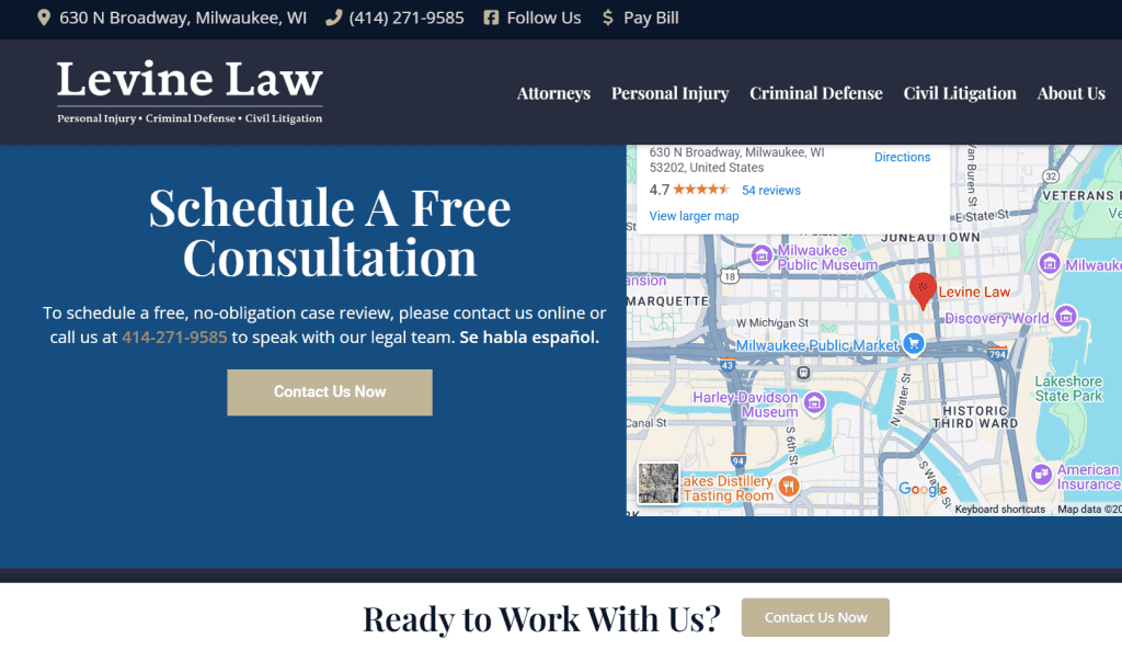
Navigation style
- Top horizontal navigation with clearly labeled dropdowns for “Practice Areas” and “Attorney”
- Clean, professional design with moderate-contrast colors for easy reading and accessibility
- Fully responsive layout, menu adapts seamlessly across desktop and mobile devices
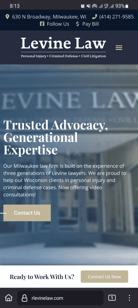
- Sticky header maintains visibility of navigation as users scroll
Key menu items
- Logical page structure: Practice Areas, Attorney Profile, About Us, Contact
- Dropdown under “Practice Areas” organizes services like Auto Accidents and Drug Crimes for quicker access.
- “Testimonials” is a sub-menu under the “About Menu”, builds credibility through client success stories.
- Footer navigation reinforces access to core pages and contact information for mobile users or those scrolling deep.

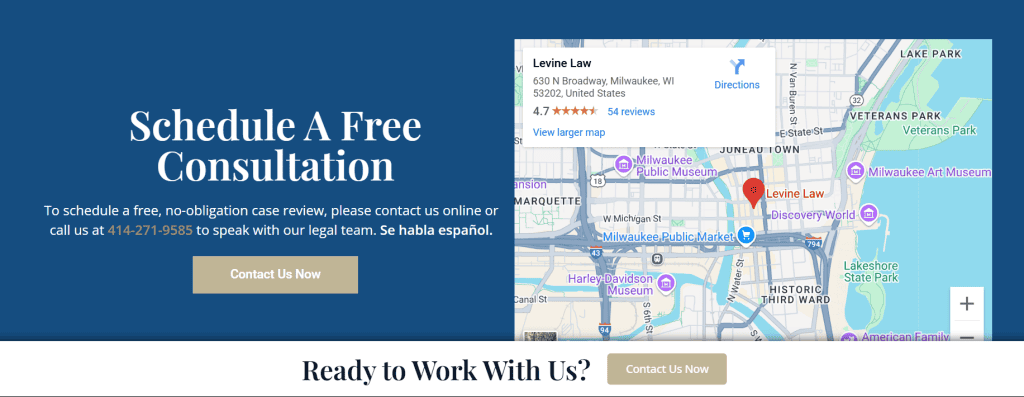
Call-to-action (CTA) placement
- “Contact Us Now” button is featured in the homepage hero section, drawing immediate attention.
- Sticky header includes a visible phone number and contact button, ideal for users ready to take action.
- Clicking “Contact Us” triggers a lightbox popup, users can submit inquiries instantly without navigating away.
Want us to design your law firm website? At Clio Websites, we understand the intricacies of the legal industry and can have you up and running in no time – Schedule your free consultation today!
2. E-commerce store
Inspired by: Allbirds (eco-friendly footwear and apparel brand)
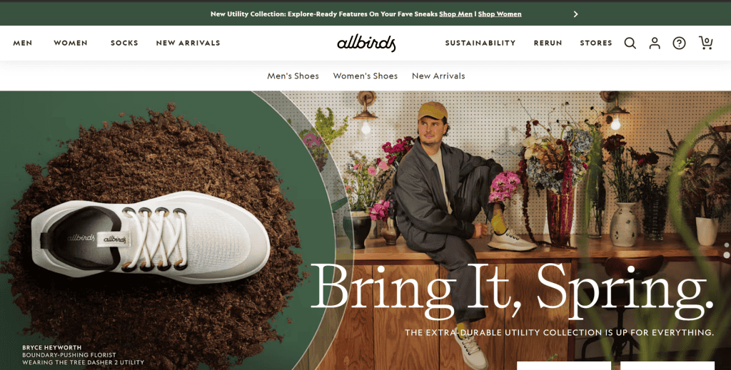
Navigation style
- Clean, streamlined top navigation bar with well-organized dropdown menus for easy product discovery
- Sticky header ensures constant access to key actions, search, cart, and user profile icons remain visible at all times.
- Minimalist design reflects the brand’s eco-conscious ethos, using simple typography and a neutral color palette.
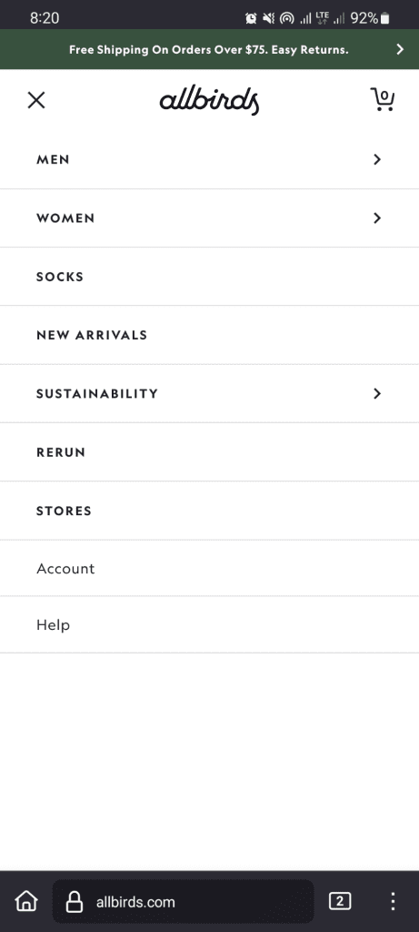
- Mobile navigation mirrors the desktop experience with collapsible menus, ensuring a seamless transition between devices.
Key menu items
- Core navigation categories: Men, Women, Socks, New Arrivals, Sustainability, Returns & Stores
- Product dropdowns feature high-quality images, enhancing visual browsing and making category selection intuitive.
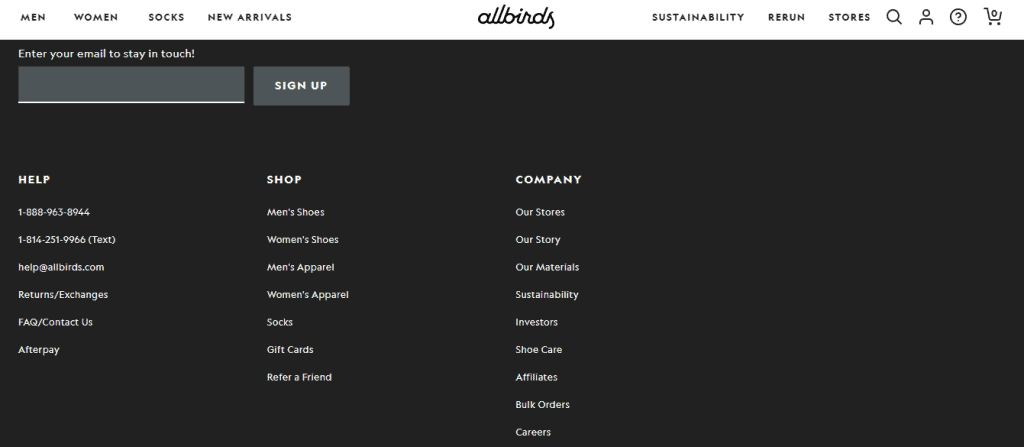
- Footer navigation reinforces customer needs with direct links to Shipping, Returns, FAQs, and Contact information.
- Sustainability section provides an added trust factor, aligning with the brand’s values.
Call-to-action (CTA) placement
- Prominent “Shop Men” and “Shop Women” CTAs are placed directly under the hero image, guiding users to shop immediately.
- The cart icon remains easily accessible throughout the shopping journey, encouraging seamless checkout.
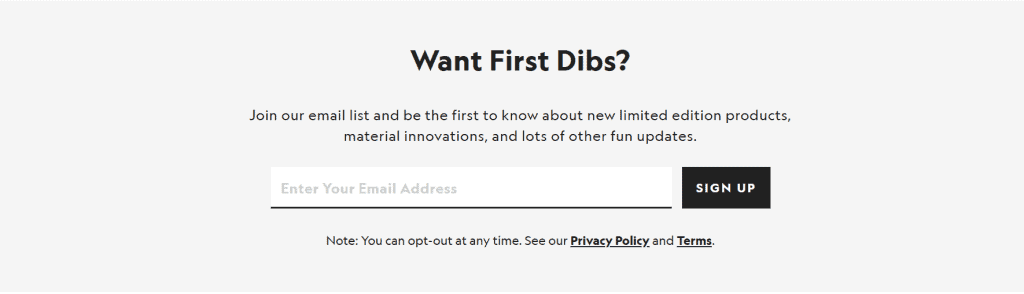
- Email signup CTA at the bottom offers a discount incentive, effectively capturing leads and increasing conversions.
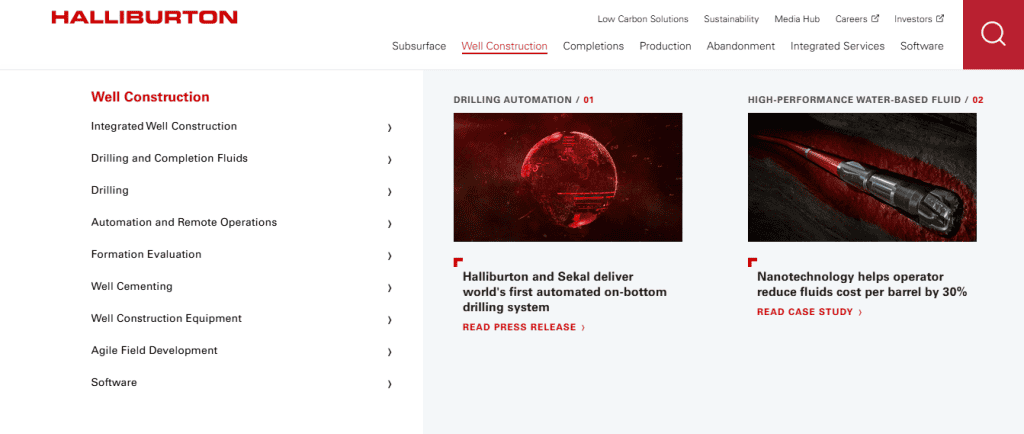
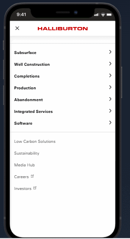
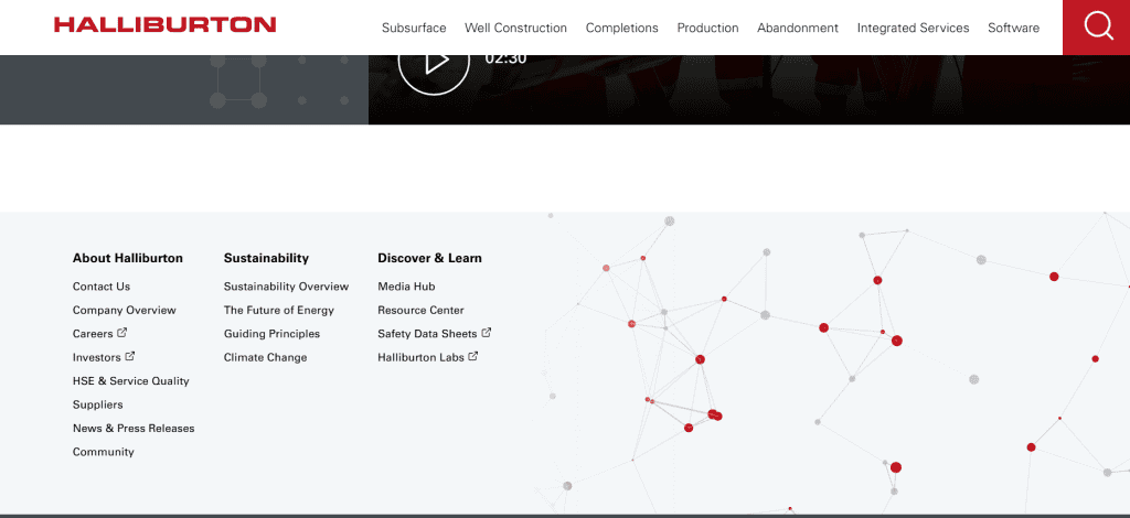
3. Oil and gas company website
Inspired by: Halliburton (Global oilfield services provider)
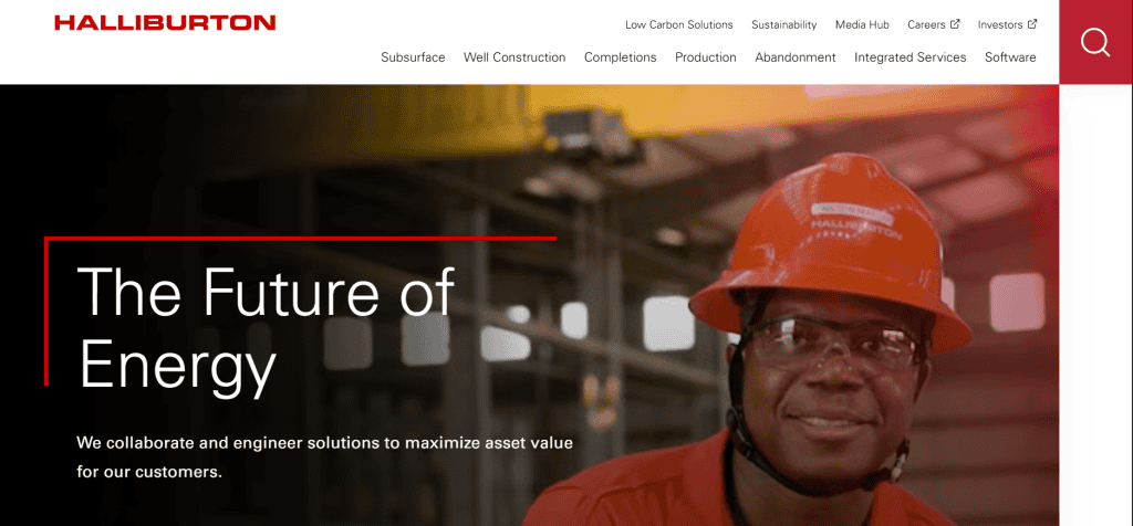
Navigation style
- Top-level navigation with dropdowns and mega menus for Services and Industries
- Corporate design with strong grid layout, professional typography, and a clean structure
- Sticky menu ensures constant access to important sections as users scroll
- The mega menu adapts seamlessly to mobile devices for a smooth user experience
Key menu items
- Main services are prominently displayed in the top navigation bar
- Secondary company links (Careers, Investors, Media Hub, etc.) are placed in a secondary menu above the main navigation
- Large search icon makes it easy for users to quickly find specific content
- Footer contains links to key company information, sustainability efforts, community involvement, media resources, and legal/compliance details
Call-to-action (CTA) placement
- Multiple CTAs throughout the homepage direct users to various areas like sustainability, joining Halliburton, and viewing press releases
- Each CTA is strategically placed to guide users through their journey on the site without overwhelming them.

Don’t want to deal with the hassle? Let’s get you started with an easy-to-navigate oil and gas website today. Explore our oil & gas website design services
4. Small business website
Inspired by: Neighbourhood Painters (local Calgary-based painting service)
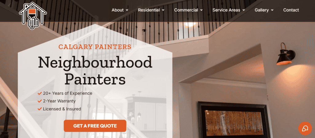
Navigation style
- Top horizontal navigation bar with dropdown menus for easy access to subcategories
- Clean, minimalist design that prioritizes user experience and streamlined navigation
- Responsive design ensures smooth functionality across both desktop and mobile devices.

- Sticky header to keep navigation visible while scrolling
Key menu items
- A clear, minimal list of essential pages: About, Residential, Commercial, Service Area, Gallery, Contact
- Trust-building elements like the About section (with links to Careers and Blog) help establish credibility and transparency.
- No separate “Services” menu item; instead, services are showcased under Residential and Commercial dropdowns
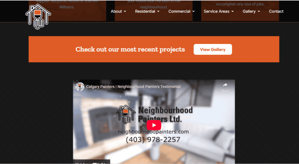
- Gallery acts as a key visual showcase, featuring completed projects and before-and-after images.
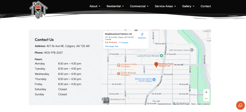
- Service area dropdown is located in both the header and footer, ensuring easy access to location-specific information.
Call-to-action (CTA) placement
- “Get a Free Quote” button is prominently displayed on the hero, styled with a standout color to encourage users to take action.
- Gallery is the second most important CTA, offering easy access to showcase completed projects and before-and-after images.
- There is a third CTA on the secondary menu above the main menu, allowing users to call their number for those who prefer to make a phone inquiry.
5. SaaS product website
Inspired by: Webflow (visual web development platform)
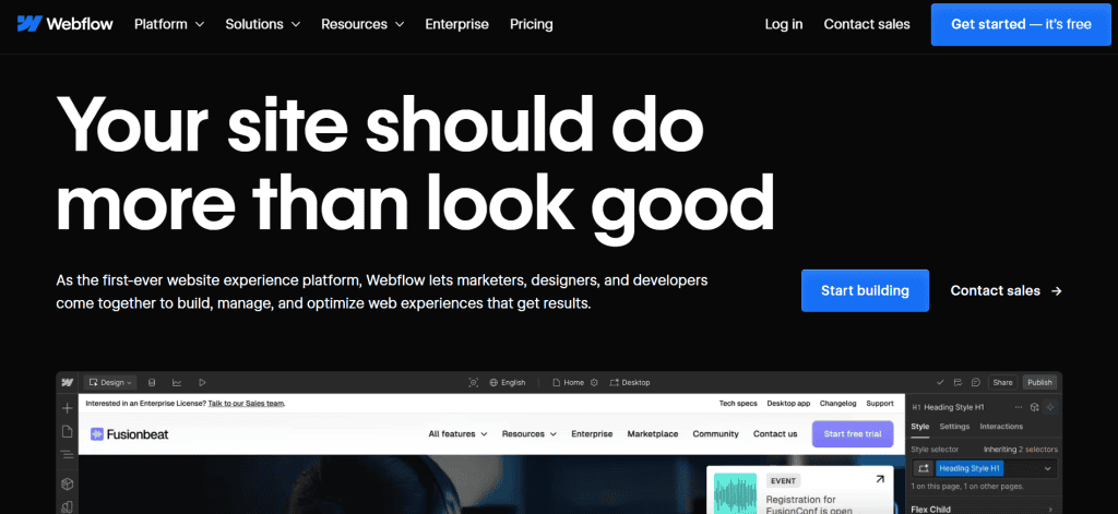
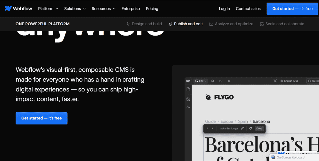
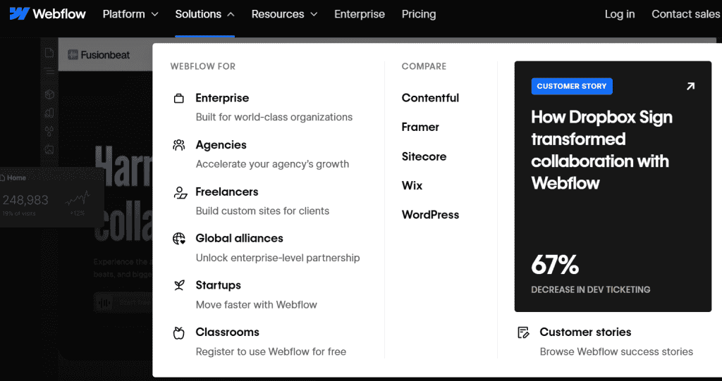
Navigation style
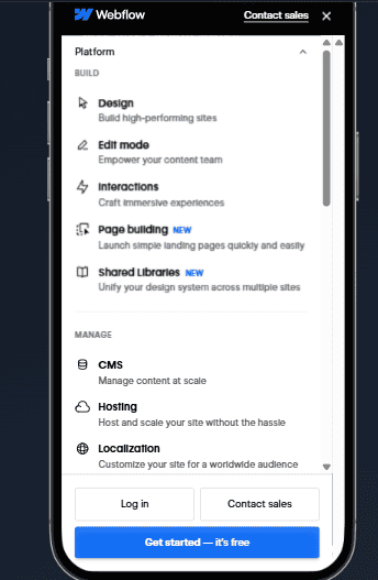
- Horizontal top navigation with clearly defined dropdowns for Features, Solutions, and Resources
- Sticky header ensures navigation is always visible, enhancing usability on long pages.
- Clean, high-contrast design for easy scanning, with hover interactions and mega menu layouts for an intuitive user experience
- Mobile navigation adapts with collapsible accordion menus for seamless product category browsing.
Key menu items
- Top links: Product, Solutions, Resources, Pricing, Login
- The “Resources” dropdown includes Blog, Ebooks, Community, and Webinars, providing visitors with valuable content to deepen their understanding
- Product pages link out to use-case demos, tutorials, and how-to guides, offering valuable insight into the product’s capabilities
- Pricing is easily accessible, directly addressing potential customers’ key considerations
- The persistent “Login” button ensures existing users can easily access their accounts
Call-to-action (CTA) placement
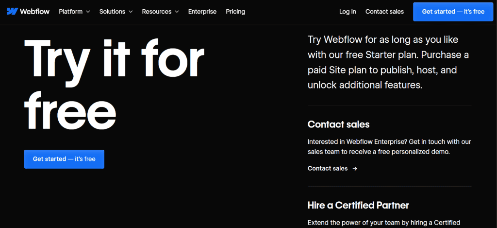
- The “Get Started” CTA is prominently placed in the hero section, encouraging immediate action with a standout blue color against a dark background.
- Persistent CTA in the sticky header remains accessible as users navigate through the site, prompting sign-ups at any point.
- Embedded CTAs like “Try Webflow for Free” are integrated on almost every page, ensuring that the user is always aware of the next steps to take
Need help designing your SaaS website? Clio Websites builds fast, conversion-focused sites for SaaS companies that grow. Let’s build something together.
6. Medical / Healthcare website
Inspired by: Mayo Clinic (U.S.-based nonprofit academic medical center)
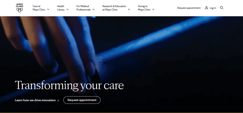
Navigation style
- Top navigation with clearly defined dropdowns for Patient Care, Departments, and Research
- Clean, accessible layout prioritizing readability and ease of navigation
- No sticky header, but the homepage is structured with various in-page links to different categories for easier access
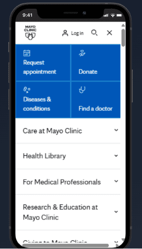
- Mobile navigation uses blocks and accordion-style menus for efficient browsing on smaller screens.
Key menu items
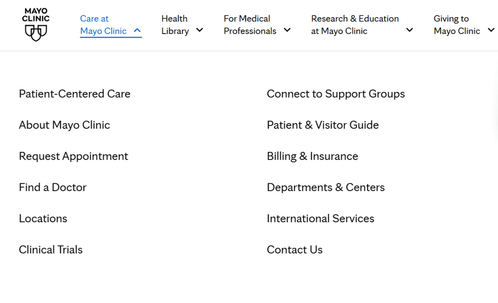
- Main menu links include: Care at Mayo Clinic, Health Library, For Medical Professionals, Research & Education at Mayo Clinic, Giving to Mayo Clinic.
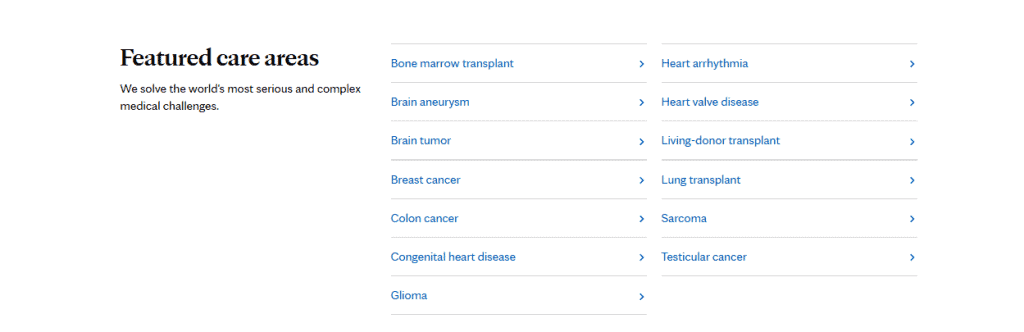
- “Patient Care” dropdown provides direct access to critical sections like Appointments, Billing, Insurance, and FAQs.
- “Conditions & Treatments” utilizes an alphabetical list for streamlined exploration of medical conditions.

- A prominent search bar is placed next to the “Conditions & Treatments” section for quick searches.
- The footer features primary links to Health Information Policy, Careers, News Network, and Financial Assistance Documents.
- Secondary footer menu includes Terms & Conditions, Privacy Policy, Notice of Privacy Practices, Accessibility Statement, and Site Map.
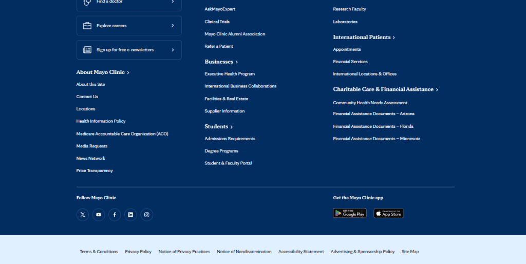
Call-to-action (CTA) placement
- “Request an Appointment” button is prominently placed in the hero section to encourage immediate engagement.
- “Find a Doctor” CTA is strategically located on condition-specific pages, ensuring users can quickly connect with appropriate medical professionals.
- The navigation structure on Mayo Clinic’s website is built for clarity and ease, ensuring that users can find critical health-related information quickly and without confusion.
Need a website that puts patients first? At Clio Websites, we build fast, accessible, and user-friendly healthcare websites that make it easy for your patients to find care and take action. Get started with our medical web design services.
Tips for Designing Effective Website Navigation
Keep It Simple
Avoid overcrowding your menu. Focus on your most important pages and limit top-level items to five or six. A clean menu helps users find what they need faster and reduces overwhelm.
Use Clear Labels
Use familiar and straightforward terms like “About,” “Services,” or “Contact.” Avoid creative wording that may confuse visitors. Clarity always beats cleverness when it comes to usability.
Make It Consistent
Use the same navigation style and structure on every page. Consistent menus build trust and help users feel in control. Changing navigation from page to page makes the site harder to use.
Highlight Important Actions
If you have a key action you want users to take; such as “Book a Demo” or “Shop Now”, make it stand out. Use a different colour, a button style, or place it in a prominent position. At Clio Websites, we ensure every site we build features clear, high-converting calls-to-action that drive results.
Design For Mobile Also
Navigation should work just as well on small screens. Use collapsible menus, large tap targets, and clean layouts. Clio Websites builds fully responsive designs that prioritize mobile usability from the start.
Use A Sticky Header
A fixed navigation bar helps users move through your site without scrolling back to the top. It improves usability, especially on long pages.
Add A Search Bar
If your site has lots of content, a search bar helps users skip menus and go directly to what they need. Keep it visible and easy to access.
Start your next web project with Clio Websites
Clear, intuitive navigation ensures that your visitors find what they need quickly, improving their overall experience and keeping them engaged longer.
At Clio Websites, we specialize in crafting custom, responsive websites tailored to your unique business needs. Our expertise in user-centric design ensures that every website we create has seamless navigation that enhances both functionality and aesthetic appeal.
Ready to build a better website? Contact Clio Websites today to get started.